21 Apr Outdoor Ad Marketing Analysis
Marketing Analysis-Outdoor Ad

Product Google
Ad Link http://www.adweek.com/adfreak/google-embeds-itself-nyc-some-delightful-site-specific-outdoor-ads-160636
Description of Ad Google worked with a variety of organizations and proprietors to bring little mini-installations to life throughout NYC. They felt that the reach was low but the fun factor was pretty high. Google placed factoid quotes that were designed to inspire curiosity throughout NYC encouraging New Yorkers to re-look at landmarks –big and small- in a new light all while highlighting their rebranding of their smart phone software search engine “OK Google”.
What was the appeal or technique used to evoke emotional response. The ad campaign was designed to be playful and therefore making a giant company appears more joyful in their detailed oriented work.
Objectives of ad campaign: Google search goal was to inspire curiosity and enabling discovery while utilizing their search engine.
Describe the target market: This ad campaign was focused on NYC at the ground level but the national attention it got broadened their base. The people they were targeting were smart phone users and potential smart phone user ideally those using an Android / Google based software.
What action does the ad want the viewer to take? Utilize their android based smartphones to do searches about anything and everything – big or small.

Product Mini Coke
Ad Link http://www.adweek.com/adfreak/coca-cola-builds-adorable-mini-kiosks-sell-mini-cokes-157669
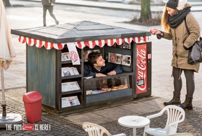
Description of Ad: Caption is that “It’s the little things in life that make us happy” message was placed around town advertising the mini size coke cans. Additionally they placed mini kiosks in five major German cities to sell those small coke cans. The mini kiosks sold on average 380 mini cans per day which is 278% more than a typical Coke vending machine.
What was the appeal or technique used to evoke emotional response. The appeal of these mini kiosks were that they were cute and little and gave you an unexpected joy that you could interact with and purchase a mini coke from.
Objectives of ad campaign: The objective was to advertise the new size (mini) Coke and to sell more cans.
Describe the target market: This campaign was limited to Germany so the target market was German citizens young and old but ideally those who wanted a little treat not a full size coke.
What action does the ad want the viewer to take? Purchase mini coke cans.

Product Nissan and Amazon joint venture
Ad Link http://www.adweek.com/adfreak/nissan-delivers-versa-note-one-lucky-buyer-enormous-amazon-box-154756
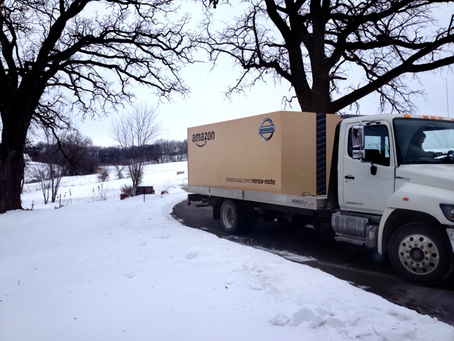
Description of Ad: Nissan and Amazon created a joint ad campaign where Nissan offered to sell its Versa Note Car to three lucky buyers on the website Amazon and that they would be shipped in an actual Amazon Boxes.
What was the appeal or technique used to evoke emotional response. The original idea was a joke where they thought it would be funny to ship a real full size car in an Amazon box. It had never been done but the idea was pretty hilarious. Everyone recognized the iconic Amazon box so it would be a win-win for both companies. The first 100 people to order the Versa Note on Amazon got $1000 gift cards and then from that list they chose the customers who got their Versa shipped in the iconic Amazon box.
Objectives of ad campaign: Sell more Nissan cars while highlighting that you can get anything delivered to your door by Amazon and it will come in the iconic box.
Describe the target market: Target market was internet shoppers in the market for a new car.
What action does the ad want the viewer to take? To purchase a new Nissan Versa Note via the website Amazon.

Product Ikea
Ad Link http://www.adweek.com/adfreak/incredible-ikea-billboard-tips-apartment-sideways-become-rock-climbing-wall-160085
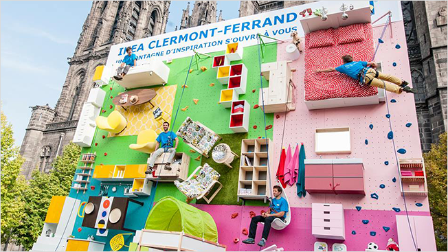
Description of Ad: Ikea promoted the opening of its 30th store in France by building an apartment into a vertical rock-climbing wall utilizing many of the products that they sell in the store.
What was the appeal or technique used to evoke emotional response. The appeal was focused at creating an interactive and fun display of their products. The wall is 9 meters high and 10 meters wide and fitted with steps and grips, allowing the public to navigate among Ikea products like beds, cabinets, tables, chairs and accessories using harnesses for safety.
Objectives of ad campaign: The objective was to create a fun environment that would highlight their stylish products and celebrate their 30th store opening.
Describe the target market: People in the market for household furnishing. Particularly those who enjoy streamline stylish designs.
What action does the ad want the viewer to take? To interact with the play space in order to position the company as both fun and stylish and a place where people would like to shop.

Product Apolosophy hair care products
Ad Link http://www.adweek.com/adfreak/wonderful-subway-ad-shows-womans-hair-blowing-around-just-train-arrives-155986
Description of Ad: The digital subway ad was located in Sweden’s train stations. It features a young woman in the ad who is sitting still until the train enters the station and then the ad shows the woman’s long hair blowing all around as though windswept by the train.
What was the appeal or technique used to evoke emotional response: The ad was to offer a simple and delightful effect that was both playful and responsive to the environment. Originally it was set to run for a day but it was kept live for five more days as a way for them to show the opportunities their digital screens can offer.
Objectives of ad campaign: The first objective was to gain attention to the Apolosophy hair care product line but due to the popularity of the interactive ad, the secondary objective was to highlight the new interactive technology of the digital screens located in the subway.
Describe the target market: The initial target market was women who would use the Apolosophy hair care products and the secondary market is other advertisers who might like to utilize the interactive digital displays in their future ad and marketing plans.
What action does the ad want the viewer to take? The initial action was to sell Apolosophy hair care products to women and the secondary action was to sell more ad space for the digital displays to other companies.


Schree Chavdarov
Posted at 02:52h, 22 AprilI really appreciate the interactive Ikea and Coca Cola ads using real people. There is a special concept that consumers see when real people are incorporated into advertisements. The Nissan Amazon joint venture ad is a good example of the collaboration efforts of two distinguished, yet different businesses.
asmcpa@yahoo.com
Posted at 23:47h, 22 AprilThanks… I loved the creativity of IKEA
Maria-Elena Surprenant
Posted at 03:17h, 22 AprilThat IKEA outdoor ad is AMAZING! I have never seen anything like it, but it is just fantastic! What a creative way to celebrate the opening of its 30th store in France. It is certainly attention grabbing.
The mini Coca-Cola ad is too cute! It of course physically depicts their new “line”, and works well in Europe because “bigger” is not necessarily “better” in their culture in comparison to the United States.
asmcpa@yahoo.com
Posted at 23:48h, 22 AprilThe IKEA was my favorite as well!
Angie Ritter
Posted at 16:23h, 25 AprilThe IKEA outdoor ad was insanely inventive! I couldn’t help but think about potential liability issues though. Maybe this a particularly American concern or perspective?? Due to our lawsuit-laden environment?
asmcpa@yahoo.com
Posted at 20:15h, 25 AprilI am guessing liability claims are limited in France. Not sure if they could do it in the US but places like NOC do have climbing walls in their stores so maybe there is hope for us after all.
Chris Carter
Posted at 01:28h, 29 AprilThe Google ad was a great choice. This not only helps promote other local businesses, but is a real world application of their intended use. Like always, you did a great job presenting the information.
Chris
asmcpa@yahoo.com
Posted at 12:34h, 29 AprilThanks so much!
Mitchell McDowell
Posted at 16:31h, 30 AprilI agree with Chris Carter. The Google ad was a great choice. The ad shows how thinking outside of the box can be used to engage a specific target market…smart phone users.
Thanks,
Mitch
asmcpa@yahoo.com
Posted at 19:53h, 30 AprilThanks. Google is always so creative!
Chris Sitzman
Posted at 15:20h, 02 MayThe Ikea ad campaign to celebrate the opening of their 30th store does a great job of drawing the attention of the viewers, while promoting many of the products they sell in their stores. The ad promotes their brand and lets the viewer get an idea of the type of products they sell. Awesome idea for an outdoor ad!
Nadia Phillips
Posted at 16:18h, 02 MayYou have a very unique selection of ads. The Google one definitely stood out the most due to the neon lights. Nice job